Facebook, the widely popular social media platform, has recently revealed subtle but noticeable changes to its app logo and color palette. The alterations come as part of a broader rebranding effort by Meta, the parent company of Facebook, aimed at refreshing the platform’s identity and enhancing user engagement.
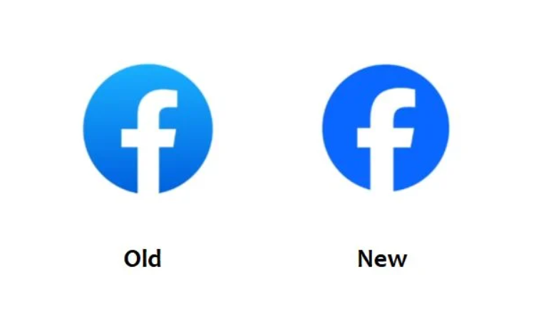
The most noticeable change is the update to the iconic “F” logo, which now appears in a deeper shade of blue and is slightly larger. Although the alterations are subtle, they represent a significant shift in the platform’s visual identity. Meta has stated that these changes are part of a broader initiative to create a distinctive and refreshed Facebook brand.
Meta outlined three key objectives for the rebranding initiative. Firstly, to elevate the most iconic elements of the Facebook brand and create a refreshed and distinctive look. Secondly, to unify how the Facebook brand is portrayed across various product-to-marketing experiences. Lastly, to create a comprehensive and vibrant color palette anchored in the core blue, making the design more accessible and visually appealing.
The emphasis on accessibility is a noteworthy aspect of the rebranding. The new Facebook logo has been designed with a more solid and comprehensible feel to enhance accessibility for all users. The incorporation of a confident expression of Facebook’s core blue color ensures stronger contrast, making the “F” icon stand out and enhancing the overall user experience.
In addition to the logo update, Facebook has introduced a new color palette and updated its reaction emojis to evoke more dimensionality and emotion. These changes are expected to be rolled out gradually over the coming months, giving users a fresh and more vibrant interface while maintaining the platform’s familiar usability.
It’s important for users and businesses to be aware of these changes, especially if they notice parts of Facebook appearing more blue or looking slightly different. Adapting to the updated design elements will be crucial for website displays and future logo usage, ensuring a cohesive and up-to-date visual representation of the Facebook brand.
In summary, the rebranding effort by Meta for Facebook signifies a subtle but significant transformation in the platform’s visual identity, aimed at enhancing accessibility and fostering effortless user exploration and connection across all touchpoints. Users can expect to see these updates gradually integrated into the Facebook app, enriching their overall experience on the platform.