Project Overview: Surrogency
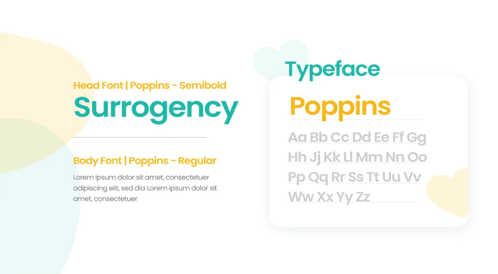
We had the privilege of working with Surrogency, a Mumbai-based startup committed to helping same-sex couples and anyone who wishes to become a parent experience the joy of parenthood. Our team was tasked with designing a new logo and branding for Surrogency that would reflect their values and mission while also appealing to their global client base. We created a logo that features the feet of a baby with a small heart embedded inside it, symbolizing the new life that Surrogency helps bring into the world. The colors used in the logo – a blue-green shade representing calmness and trust, and a bright yellow-orange shade representing joy and happiness – were chosen to reflect Surrogency’s commitment to providing a positive, supportive experience for their clients.
Color Palette
Trust, Stability, and Professionalism.
Logo Concept
Baby Feet & A life within


